
What's Your Colour Quirk?

Source: K Kroeker
The question that elicits the strangest looks from clients in a design consultation is invariably: Are there any colours you would prefer to exclude from your landscape design?
The response happens one of two ways: a definite yes followed by the certain colour or colours the client doesn’t like or a pause and a tilt of the head, with a questioning look as if they are wondering whether they heard the question clearly. It’s kind of funny.

Source: K Kroeker & C Rice
For the record, I’ve heard everything: “I hate yellow. I don’t like light pink. No red. Anything but orange. Absolutely no pink. No white flowers... Huh?”
Like just about any design topic, colour can be polarizing; It can unite us in symbolism as we cheer, and trigger complete aversion just as easily. No matter what you prefer, experience tells me that will probably live with or next to someone who hates your favourites.
The funny thing is, is that our landscape or flower preferences may be in complete contrast to our preferences in our home interiors — or maybe that’s just me. I love colour in my home. I especially love a blend of colours. I once painted my bedroom a vibrant coral, which to this day, my darling stepdaughters insist it was pink. But do I want my garden to be a riot of colour? Absolutely not.

Source: K Kroeker
I happen to live with someone who loves all the colours. Nothing makes Merle happier than options. Personally, I prefer a more curated palette: white and purple.This doesn’t mean I don’t love colours in the landscape, I just prefer them in other people’s landscapes. My mother doesn't feel at home without pink and purple flowers, but if my father got his way, only white blooms and green foliage would grow in their garden.

Source: K Kroeker & C Rice
So why is there such a strong reaction to colour? Because very little expresses our personality in such an intuitive way. We react instinctively to colour. It energizes, soothes, communicates in powerful ways. We crave colour in our lives. How often have we said about anything, “It needs a little colour”?

Source: K Kroeker
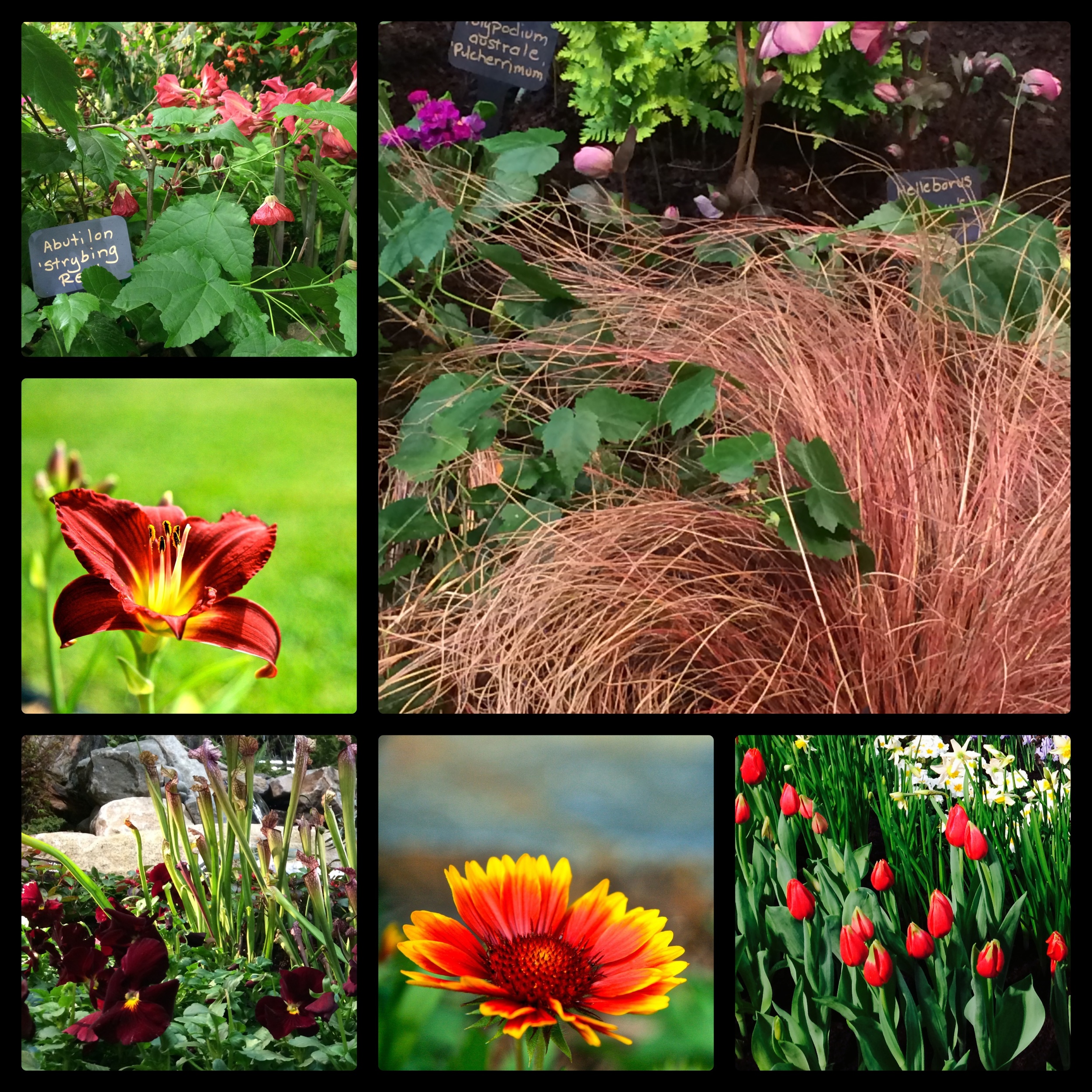
How we employ colour in our landscape is varies greatly, as we saw at the Northwest Flower and Garden Show in Seattle. Colour was everywhere: primulas, and tulips, grasses, hellebores, garden art and accessories. It was a colour extravaganza, yet what was most interesting was how colour was deployed. In some of the gardens, it was used deliberately with precision. There were at least three points of repetition, and you could easily triangulate the colours, ensuring a cohesive feel.
Source: K Kroeker & C Rice
In one display garden in particular, the deployment of colour seemed at first, more haphazard. But on closer inspection, it became clear that there was deliberate thought behind the array. The colours spilled into each other, blending in an organic way. There wasn’t a specific beginning and end to the colours, they ebbed and flowed amongst one another. It clearly wasn’t for everyone, but it was extremely well executed. It was almost the landscape equivalent of shabby chic, deliberately relaxed and designed to look effortless.

Source: K Kroeker
But how does this help us when we are standing in the nursery aisles, surrounded by plants of every colour, wondering which ones belong in our garden? Here are two steps to make it easier.
Pay attention to your gut. You might notice that your gut is drawing you to a colour that isn’t what your mind wants. This is a key distinction. If you go with your mind, you will have a garden that pleases you intellectually, but never becomes a place of rest. If you go with your gut, that same instinctual attraction will draw you into your garden every time, and it will just feel right.
Think about the colours that you already have. If you want to underscore and enhance what you have, then pick colours in the same tones. An easy rule of thumb is 2:1 light and dark, or the other way around. This will give you the ability to highlight and contrast which creates depth and visual interest. If you are looking to contrast the existing colours, choose one colour and bring home its contrasting colour. Don’t try to contrast all the colours unless you want a Dr. Seuss garden.
